7 Welcome Board Ideas That Turn Guests Into Instagram Posters
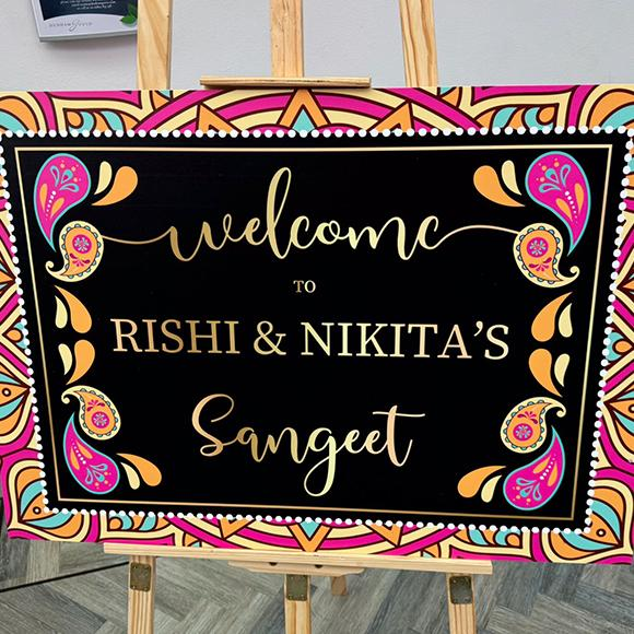
Every event begins at the entrance, and the first thing guests notice sets the tone for everything that follows. A thoughtful sign does more than say hello. It gives people a reason to pause, smile and reach for their phones. Weddings, birthdays, baby showers and corporate evenings all benefit from that moment, because every photo shared online becomes free promotion for your celebration. These seven ideas show how simple design choices can turn an ordinary entrance into a backdrop worth posting, even on a modest budget and a tight schedule.
Why Entrance Signs Get Photographed
People photograph what feels personal and visually balanced. A well-designed welcome board works because it combines readable text, a clear colour palette and a style that reflects the hosts. When guests see something made with care, they naturally want to capture it, and often stand beside it for a picture.
Before choosing a design, think about three things: the mood of the event, the space where the sign will stand, and the message you want to share. These choices guide everything that follows.
7 Ideas Guests Will Want to Photograph
1. Handwritten-Style Lettering
Flowing script feels warm and personal. It suits weddings, anniversaries and garden parties. Keep the wording short so the lettering stays large and easy to read from a distance.
2. Personalised Names and Dates
Adding the names of the couple, the birthday guest or the family makes the sign feel unique. Guests love posing next to something that carries a real name, and the date helps the photo double as a keepsake.
3. Floral and Botanical Frames
Leaves, wildflowers and soft borders add texture without cluttering the layout. A welcome board with a gentle botanical frame looks lovely in natural light and pairs well with real flowers placed at the base of the stand.
4. Bold Minimalist Typography
Not every event suits decoration. Clean sans-serif letters on a plain background look modern and confident, which works well for corporate launches, graduations and engagement parties. White space is your friend here, because it lets the text stand out.
5. A Mini Story Timeline
Instead of a single greeting, add a few short milestones: how you met, a favourite trip, a shared hobby. Guests stop and read, which means they stay longer in front of the sign. Good board printing keeps small details crisp, so even compact text remains legible in photos.
6. Playful Humour and Quotes
A light joke or a friendly line gives guests something to smile about. Keep the tone consistent with the event. Humour works best when it feels like the hosts’ own voice rather than a generic phrase.
7. Seasonal and Themed Designs
With winter celebrations approaching, themes such as frosted pine, warm candlelight or festive gold feel timely and welcoming. A seasonal palette also looks natural in photos because it matches the surrounding decor.
Choosing the Right Material and Print Quality
A beautiful design only works if it is printed well. Colours should look rich, edges should be clean, and the surface should avoid harsh glare under camera flash. Matte finishes usually photograph better than very glossy ones, since they reduce reflections.
Material matters just as much. Rigid boards hold their shape on an easel, while lighter options suit indoor events that need easy transport. If you want to understand how print choices affect visibility and presentation, this Medium read on why quality printing supports clear signage offers useful background that applies to event displays too.
Placement and Lighting Tips
Even the best design can be missed if it is placed poorly. Follow these simple guidelines:
- Stand it at eye level. Guests should read it without bending or stepping back too far.
- Use soft lighting. Natural daylight or warm lamps are far kinder than direct overhead beams.
- Leave space around it. A clear area lets guests pose comfortably without blocking the doorway.
- Check the background. A plain wall or greenery keeps attention on the sign.
- Test the view. Take a quick photo yourself and adjust the angle before guests arrive.
Planning these details in advance helps a welcome board look polished in every photo, from the first arrival to the last goodbye.
Common Mistakes to Avoid
Many hosts lose impact by overcrowding the design. Too many fonts, colours or decorations make the message harder to read. Another frequent problem is small text, which disappears in photos taken from a few steps away. Finally, rushing the proof stage can leave spelling errors that are painful to spot after printing. Always check names, dates and spellings twice, and ask a friend to review the final file. Careful board printing starts with a clean, well-checked design, so a few extra minutes at this stage can save a lot of disappointment later.
Final Thoughts
A great entrance does not need to be complicated. It needs personality, clear lettering and a design that matches the mood of your event. Pick the idea that suits your theme, keep the message short, and think about how it will look in a photo. If you want help turning a concept into a finished, professional piece, Board Printing Company can guide you through sizes, materials and finishes so your signage arrives ready for the big day. Your guests will do the rest, sharing every smile and every detail online.
Comments
Post a Comment