Posts

How to Use an Edge Strip to Make Shelf Prices and Offers Impossible to Miss
Image
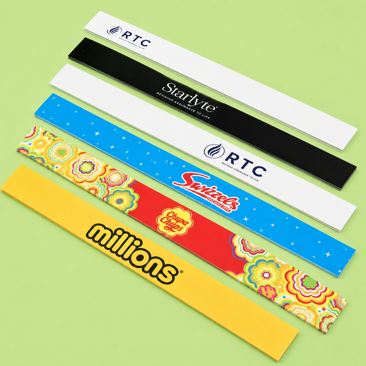
Walk down any supermarket aisle and your eyes settle on a handful of things: a price, a bright flash of colour, a word like “new” or “offer”. Shoppers decide quickly, often in seconds, so retailers have little time to make information visible. The shelf edge is one of the most useful places to do it, because it sits directly in the line of sight. This guide explains how small printed labels guide buying decisions, how to design them clearly, and how to avoid the errors that make price messaging confusing. What is Shelf-Edge Messaging? Shelf-edge messaging means any printed information placed on the front lip of a shelf, usually where the product sits just above or behind it. It typically covers prices, unit costs, promotions, product names and short descriptions. Its strength is placement. A shopper looking at a product naturally glances at the shelf edge beneath it, so the message arrives at the exact moment a decision is being made. That timing makes it more ef...

Is Your Acrylic Board Too Flimsy? How to Choose the Right Thickness Before You Order

Image
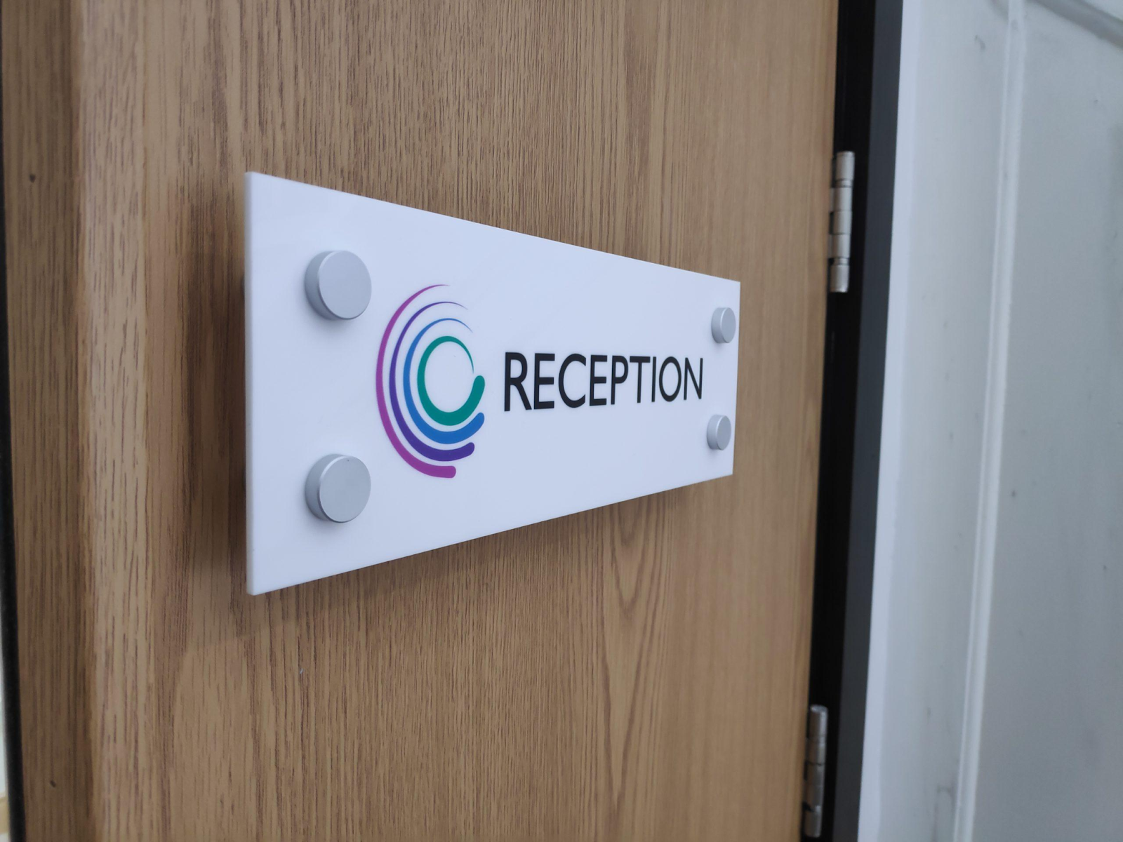
A sign that bows in the middle or rattles on its fixings never looks professional, no matter how good the artwork is. Thickness is the quiet detail that decides whether a printed panel feels solid or flimsy, yet many buyers choose it last, or leave it to guesswork. A few simple questions about size, location and fixing method can prevent costly reorders. This guide explains how each common thickness behaves, what warning signs to look for, and how to match the right option to your own space before you order. Why Thickness Matters More Than You Think Acrylic is a rigid plastic, but rigid does not mean unbendable. Every sheet flexes a little under its own weight, and the larger the panel, the more obvious that movement becomes. A thin sheet stretched across a wide area will sag, ripple or reflect light unevenly, which makes printed colours look distorted. Thickness also affects how a sign feels in the hand. A solid panel gives an impression of quality before anyone reads a word. A flimsy...

Why Hotels and Cafes Keep Choosing a Strut Card for Everyday Messaging

Image
Walk into any busy hotel lobby or neighbourhood cafe and you will notice small printed stands sitting on counters, tables and front desks. They announce offers, share Wi-Fi details, point out menus and remind guests of house rules. Each carries a short, useful message. Business owners often choose them because they are affordable, quick to update and easy to place almost anywhere. This guide explains why hospitality teams rely on this format, how to design one properly, where to position it, and how to avoid mistakes that weaken everyday messaging. What is a Strut Card? A strut card  is a printed card with a fold-out support strip on the back, which lets it stand upright on a flat surface. There are no frames, stands or fixings to buy. You simply fold the strip, place the card on a counter or table, and the message is on display. Most are made from sturdy printed board, so they hold their shape through daily handling. Common sizes range from small table-top formats to larger counte...

7 Welcome Board Ideas That Turn Guests Into Instagram Posters

Image
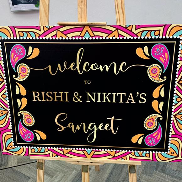
Every event begins at the entrance, and the first thing guests notice sets the tone for everything that follows. A thoughtful sign does more than say hello. It gives people a reason to pause, smile and reach for their phones. Weddings, birthdays, baby showers and corporate evenings all benefit from that moment, because every photo shared online becomes free promotion for your celebration. These seven ideas show how simple design choices can turn an ordinary entrance into a backdrop worth posting, even on a modest budget and a tight schedule. Why Entrance Signs Get Photographed People photograph what feels personal and visually balanced. A well-designed welcome board works because it combines readable text, a clear colour palette and a style that reflects the hosts. When guests see something made with care, they naturally want to capture it, and often stand beside it for a picture. Before choosing a design, think about three things: the mood of the event, the space where the sign wi...

Correx Boards vs 3mm Acrylic: Which Printed Sign Survives a British Winter Better?

Image
British winters are tough on anything left outside. Rain, frost, wind and short grey days all take a toll, and a business sign must stay sharp through every one of them. If you are choosing between correx boards and acrylic for your next outdoor display, the material you pick matters more than most people expect. This guide explains how each option behaves in cold, wet conditions, where each one works best, and how to look after it, so you can decide with confidence before the next big winter storm arrives. Why Winter is the Real Test for Printed Signs A sign that looks great in June can fall apart by January. In the UK, outdoor signage faces several stresses at once: Constant moisture: Rain, drizzle and fog soak into anything that is not properly sealed. Freeze-thaw cycles: Temperatures swing above and below zero, making materials expand and contract. Strong winds: Autumn and winter storms put heavy pressure on boards fixed to fences, railings or frames. Low light:...