Why Hotels and Cafes Keep Choosing a Strut Card for Everyday Messaging
Walk into any busy hotel lobby or neighbourhood cafe and you will notice small printed stands sitting on counters, tables and front desks. They announce offers, share Wi-Fi details, point out menus and remind guests of house rules. Each carries a short, useful message. Business owners often choose them because they are affordable, quick to update and easy to place almost anywhere. This guide explains why hospitality teams rely on this format, how to design one properly, where to position it, and how to avoid mistakes that weaken everyday messaging.
What is a Strut Card?
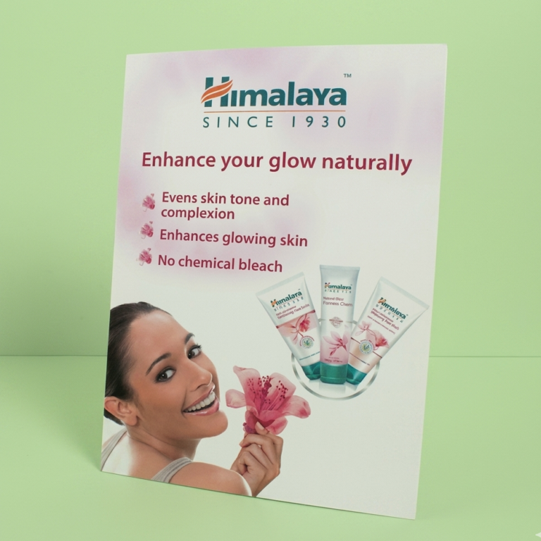
A strut card is a printed card with a fold-out support strip on the back, which lets it stand upright on a flat surface. There are no frames, stands or fixings to buy. You simply fold the strip, place the card on a counter or table, and the message is on display.
Most are made from sturdy printed board, so they hold their shape through daily handling. Common sizes range from small table-top formats to larger counter versions, and the choice depends on how far away the reader will be.
Why Hospitality Businesses Prefer This Format
Hotels and cafes change their messaging constantly. Menus rotate, promotions end and seasonal notices come and go. A format that is cheap to reprint makes those changes painless.
Key benefits include:
- Low cost: Printing several versions for different areas stays within budget.
- Easy placement: Staff can move a card in seconds without tools.
- Quick replacement: A worn or outdated card can be swapped the same day.
- Clear focus: A single card carries a single message, which readers understand quickly.
- Flexible use: The same format works on a bar, a bedside table or a service counter.
How Hotels Use Printed Stands Across the Property
In a hotel, information is needed at many points: arrival, dining, leisure and departure. Each area has its own questions, and clear printed messages reduce the number of times staff are interrupted.
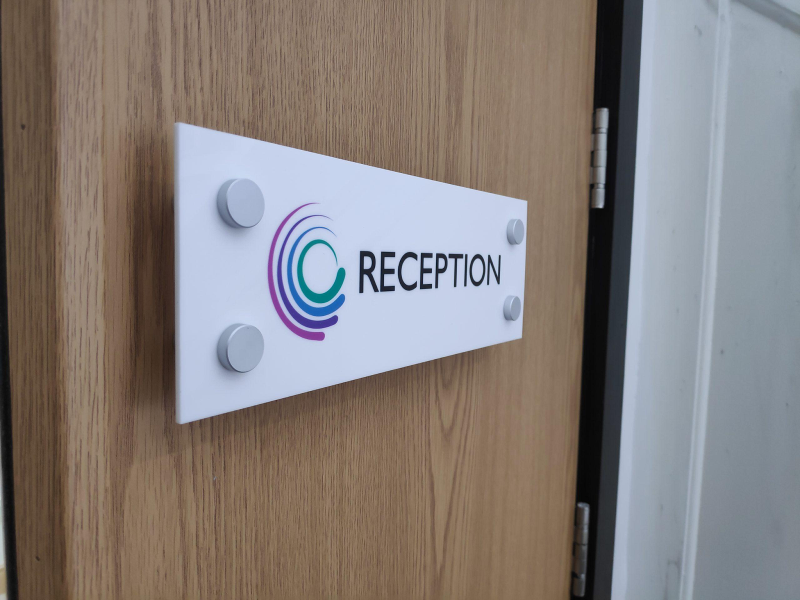
At the front desk, reception signs can explain check-in times, parking arrangements or luggage storage. Guests arriving tired after a journey appreciate answers that are visible without having to ask. In rooms, small stands can share breakfast hours, Wi-Fi instructions or spa timings. In corridors and lifts, they can point guests toward facilities.
Good placement also shapes the wider guest journey. When visitors find clear cues the moment they step inside, they feel relaxed and confident instead of confused. This guide on improving visitor experience in business spaces shows how well-planned displays help guests feel welcome and oriented from the first minute.
How Cafes Make the Most of Them
Cafes work in a different rhythm. Customers decide quickly, often while standing in a queue, so messages need to be short and appealing.
A strut card on the counter can promote a seasonal drink, a loyalty offer or a lunch deal. On tables, it can share ordering instructions, allergen reminders or a QR code for the menu. Because the cards are inexpensive, owners can print a fresh set for each season, which keeps the space feeling current without a large budget.
Cafes also use them to reinforce brand personality. A friendly tone, a few well-chosen colours and a consistent style make even a simple notice feel like part of the experience.
Design Principles That Make Messages Readable
A card that is hard to read gets ignored, however useful the message may be. Keep these principles in mind:
- One message per card: Crowded layouts confuse readers.
- Use large, clear fonts: Text should be readable from at least a metre away.
- Choose strong contrast: Dark text on a light background, or the reverse, works best.
- Add a clear call to action: Tell guests what to do, such as scan, ask or try.
- Stay on brand: Use the same colours and typefaces as your menus and website.
White space matters as much as the words themselves. A little breathing room around the text helps the eye settle on the main point.
Placement Tips for Better Visibility
Where a card sits can matter more than what it says. Place it at natural eye level and in the path guests already follow. On a cafe table, the centre is usually best. On a hotel desk, position it where guests rest their hands or wait.
Avoid placing cards near bright windows where glare makes reading difficult. Keep them away from spills and heavy traffic, and never block key equipment such as card machines. Where space is limited, rotate messages through the day rather than crowding the surface.
Consistency across the venue also helps. When reception signs and table cards share the same design language, the whole property feels organised and professional, which quietly builds trust with guests.
Choosing the Right Material and Finish
Daily handling is tough on printed materials. Look for thick, rigid board that resists bending, and consider a matte finish to reduce reflections under indoor lighting. If cards may face moisture, such as near a bar or kitchen pass, ask about coated or laminated options.
Edges should be cleanly cut, and the support strip should fold crisply without tearing. A weak fold means the card tips over, which looks careless and frustrates staff.
Common Mistakes to Avoid
Even simple printed stands can fail if basic rules are ignored. Watch out for these problems:
- Too much text: Guests will not read long paragraphs on a counter.
- Outdated information: An expired offer damages trust quickly.
- Poor spelling or wrong prices: Always proofread twice before printing.
- Inconsistent styling: Mismatched fonts and colours make a venue look disorganised.
- Overuse: Too many cards on one surface turn helpful messages into clutter.
A regular review habit solves most of these. Once a month, walk through your venue as a guest would, and remove or update anything that looks tired. A single strut card that has faded or curled can undo the polished impression created by everything around it.
Keeping Everyday Messaging Fresh
Treat printed messaging as a living part of your business. Update seasonal content early, keep spare copies of popular designs, and train staff to replace worn items without being asked. A small stock of ready-to-use cards makes this easy.
It also helps to keep notes on what works. If a particular offer card drives more orders, repeat the style. If a notice is regularly ignored, simplify the wording. Over time, these small adjustments make your messaging sharper and your reception signs and table displays more effective.
Final Thoughts
Small printed stands may look modest, but they shape how guests understand and enjoy a space. Clear wording, sensible placement and durable printing turn them into dependable tools that save staff time and answer common questions before anyone has to ask. Review your messaging regularly, keep designs consistent with your brand, and replace worn pieces. If you would like guidance on sizes, finishes, and materials for your venue, Board Printing Company can help you choose options that suit your budget and daily needs, so every guest receives clear information on arrival.
Comments
Post a Comment